Mobile-Friendliness – The Impact on SEO
On-Page Optimization: The Key to SEO Success
December 5, 2022
SEO Expert – Is Hiring One Right for Your Business?
December 5, 2022
No Longer a Secret
It's no secret that mobile usage has been on the rise for years. In fact, as of 2018, mobile devices have officially overtaken desktop computers in global internet usage. This trend will only continue, so your website must have mobile-friendliness optimized for mobile users.
Key Factors for SEO
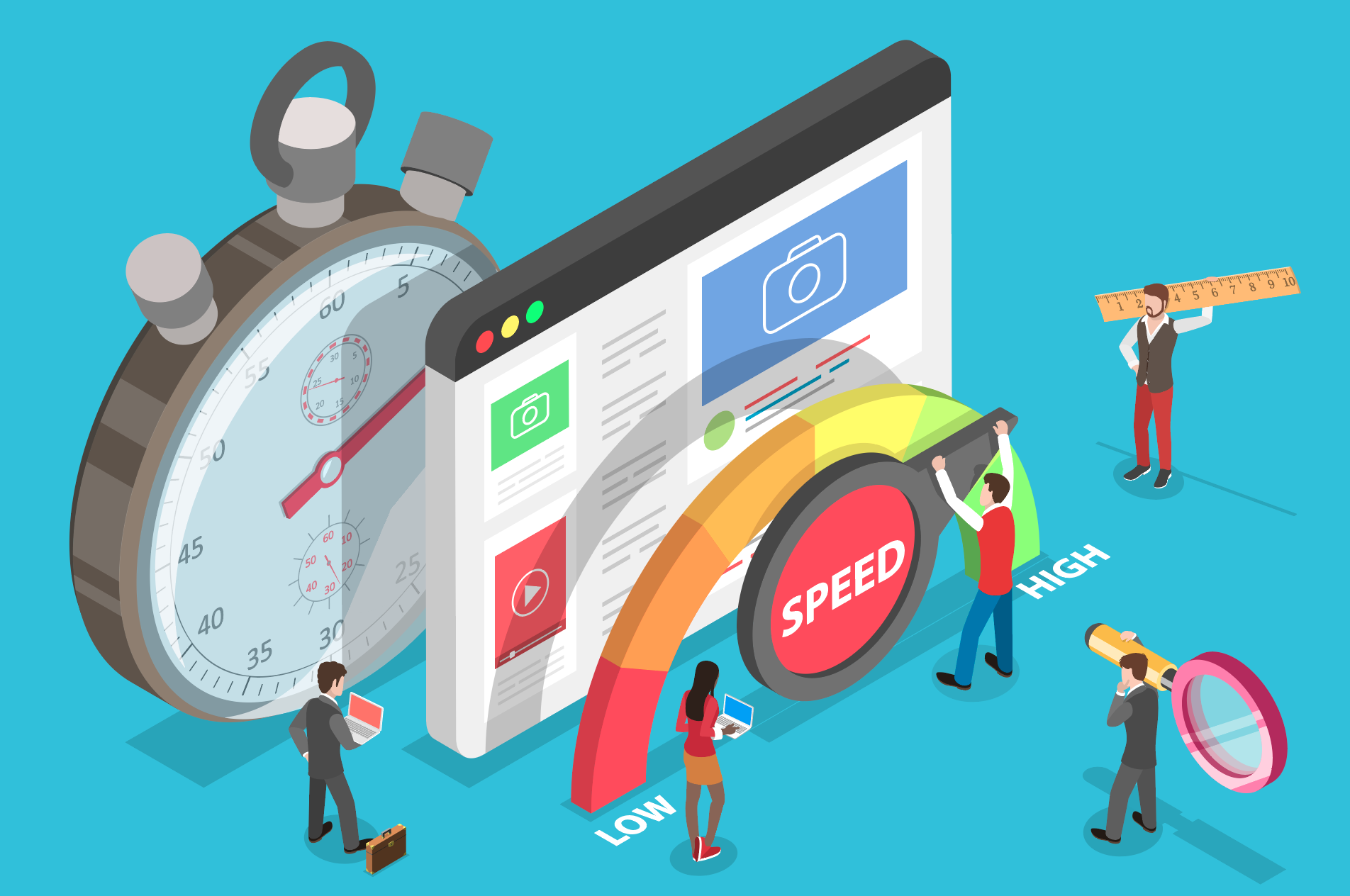
Regarding SEO, mobile-friendliness is one of the key factors for ranking success on search engine results pages. Mobile-friendly websites are optimized to display and interact with mobile devices, meaning they are easier to navigate and user experience is improved. In addition, mobile-friendly websites tend to load faster than those not optimized for mobile. Google now considers mobile-friendliness as a factor in its algorithm when ranking sites. This means if your website is not mobile-friendly, you may find yourself struggling to rank higher on SERPs.
Where to Start?
First and foremost, ensure that all of your content is optimized for mobile devices. This means reducing page loading time by optimizing images, videos and other elements on the page. Additionally, use responsive web design so your website automatically adjusts its layout based on the size of the device used. Finally, use larger font sizes and buttons to make it easier for users to navigate on mobile devices.
What is AMP?
AMP stands for Accelerated Mobile Pages and is an open-source initiative created by Google aimed at helping mobile users access content faster. AMP allows mobile websites to load quickly, with fast page loading speeds and a better mobile user experience. It also increases visibility on mobile SERPs since it makes a mobile website eligible to appear in “Top Stories” mobile SERPs.
Another way to improve mobile-friendliness is by implementing Accelerated Mobile Pages (AMP). AMP is an open-source framework designed to help webmasters create fast and optimized mobile versions of their websites.
Important AMP factors in Mobile:
- Reduce page loading times
- Simplify mobile navigation
- Improve mobile usability
- Make images mobile friendly
Testing for Mobile-Friendliness
To check if your website has mobile-friendliness, enter your URL into Google's mobile-friendly testing tool. If your site passes the test, then congratulations! Your website has mobile-friendliness, and you'll likely be rewarded with higher SERP rankings. If your site fails the mobile-friendly test, don't worry! There are a few simple steps you can take to make your website mobile-friendly quickly and easily.
Common Mobile-friendly testing tools:
- Google mobile-friendly test
- Bing mobile-friendly test
- W3C mobile OK checker
By ensuring your website has mobile-friendliness, you'll greatly improve the user experience, which will help your SEO rankings. The mobile-friendly version of your website will be easier to use, load faster and result in higher engagement from mobile users. These are key factors in Google's algorithm when determining SERP rankings.
**useful links**
- Google mobile-friendly testing tool: https://search.google.com/test/mobile-friendly
- What is mobile SEO?: https://moz.com/learn/seo/what-is-mobile-seo
- Responsive web design guide for beginners: https://blog.teamtreehouse.com/beginners-guide-to-responsive-web-design

Terry’s cauldron of knowledge in the digital world is the result of a background in advertising, graphic design, web and multimedia development… 25 years in this business.